28
$\begingroup$

I just went to a question I had already voted on, and wasn't sure which way I had voted:

enter image description here

Intuitively, it seems that the brighter arrow (down) would be the direction I voted - but I actually upvoted the post.

Compare to a post I haven't voted on:

enter image description here

The arrows feel too bright overall; distracting from the content of the post.

Could they be toned down a little?

$\endgroup$
5
  • 2
    $\begingroup$ Totally agree, and I just made similar comments about it in the Hanger chatroom. $\endgroup$
    – abelenky
    Commented Jul 1, 2016 at 18:26
  • 2
    $\begingroup$ Literally signed up to upvote this $\endgroup$
    – muddyfish
    Commented Jul 1, 2016 at 19:05
  • 1
    $\begingroup$ @abelenky heh. I was so sure it was you who posted, didn't even check who did... sorry Undo.. ;) $\endgroup$
    – falstro
    Commented Jul 1, 2016 at 19:18
  • 3
    $\begingroup$ Most every other SE site has colorless=unselected, and the buttons gain color when clicked. When you visit a page here for the first time, it looks like you've already voted the question both up and down. :) $\endgroup$
    – Ben Miller
    Commented Jul 1, 2016 at 19:21
  • 1
    $\begingroup$ @BenMiller That was my feeling too. Oh, and a little bit more contrast for the vote buttons here on Meta, too, maybe? :-) $\endgroup$
    – user
    Commented Jul 1, 2016 at 20:45

3 Answers 3

5
$\begingroup$

Please see the update of the original post.

$\endgroup$
13
$\begingroup$

I'd be in favor of reversing the colors (make "unselected" arrows dark & "selected" ones light) - I think that would make the difference more intuitive and the unvoted arrows less obtrusive - probably with the least work :)

$\endgroup$
0
9
$\begingroup$

I agree with this complaint! At first glance, would you say that I upvoted or downvoted the question below?

Upvote/downvote screenshot on Aviation

When I visited the site the first time after the redesign, I thought: "Why did I downvote such a good question?" On Stack Exchange sites, the more brightly coloured arrow is the one what was selected. (When you press the flight attendant call button, it lights up, right?)

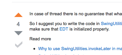
Compare that with Stack Overflow, where the display is unambiguous:

Upvote/downvote screenshot on Stack Overflow

I believe that the colours you have chosen are reversed. In any case, it is a confusing colour pair. For clarity, the arrow not selected should ideally be light gray. Please fix it.

$\endgroup$

You must log in to answer this question.