3
$\begingroup$

I'm sorry Stephane - I know we have been a picky community requesting various changes to the design. I have just one more minor suggestion:

Now that the blue color of the text is tuned down, I found my eye focus constantly leaning towards the left side of the page, specially, towards the votes indicators (and its buttons) of each post. With the text color duller, the blue of the vote arrows stands out, and the visual balance is lost:

enter image description here

Compare this with the image of workplace.SE below, which features a similar color scheme:

enter image description here

Can we have the blue arrows de-saturated (and dimmer) a bit please? Making it completely grey would be ideal, but some duller blue should work as well.

$\endgroup$
2
  • 1
    $\begingroup$ I’m no regular here, but whenever I visit a question (e.g., from the Hotlist), the bright blue gives me the impression that I already voted for it, and it’s the first thing my eyes focus on. Then I notice that the downvote button has the same color, so it can’t be, and only then I focus on the title/question itself. $\endgroup$
    – unor
    Commented Jul 8, 2016 at 16:44
  • $\begingroup$ @unor I came here to say exactly the same thing. But I do like Jay Carr's point in the comments on voretaq7's answer below. $\endgroup$
    – Tim Malone
    Commented Aug 7, 2016 at 7:43

1 Answer 1

4
$\begingroup$

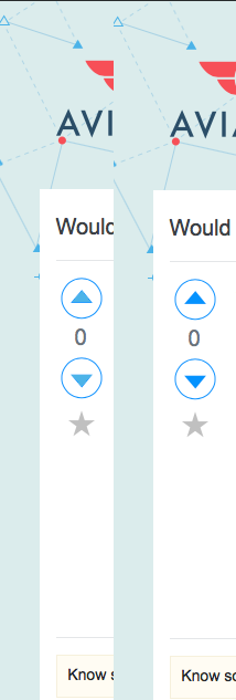
The blue in the arrow seems to be a match to (most of) the blue triangles in the map, as well as the Ask Question button and the section highlight line. I tried desaturating them to match (the other, lighter) blue triangles in the map. The difference is pretty subtle (at least on my monitor): I prefer the darker arrow because the lighter one looks "washed out" to me, but I don't hate the lighter one.

Going much lighter than this made the arrows look washed out to me.

Arrows - New/Orig
(Left = new, Right = original)

Gray arrows might work, but I feel like they would get lost on the page - the blue draws your eye to the arrows to remind you to vote, which I think is a positive thing here.

(For reference the "lighter arrow" color is matched to the waypoint triangle off the left "wingtip" of the logo - GIMP claims it's #4CB3E8. It's a gross hack bucket fill, and I didn't adjust the ring color at all.)

$\endgroup$
2
  • 1
    $\begingroup$ I'm with voretaq7 on this one. I like how the arrows look. Personally I like the fact that they draw attention because, frankly, people don't use the vote arrows quite enough in my opinion! ;). Maybe this will help people remember them better. At any rate, I do think they stand out, but I don't think it's obnoxious. So I'd leave it personally. $\endgroup$
    – Jae Carr
    Commented Jul 7, 2016 at 16:41
  • 1
    $\begingroup$ When I first came to the site today after the design was published and saw the blue buttons, I thought "wow such nice, clean, sharp colours!" Please keep the blue! $\endgroup$
    – yo'
    Commented Jul 8, 2016 at 8:59

You must log in to answer this question.

Not the answer you're looking for? Browse other questions tagged .