In five years, that's the second or third time someone edits my post to change bold headings into true HTML header style (H1). That's to say this is not a frequent request.
Let me explain the problem you points to:
When I see this:

I'm certainly very happy with the design, it looks nice! What about this:

In this case the header style uses very large fonts. I won't definitely not use this. Presentation is as important as content. I rather use bold characters:
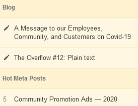
Blog
A Message to our Employees, Community, and Customers on Covid-19
The Overflow #12: Plain text
Hot Meta Posts
- Community Promotion Ads — 2020
So you're question boils down to whether I've the right to not use headers but bold characters, knowing that badly written screen readers software may not recognize this bold inter-paragraph title as a structuring elements, and therefore won't include it in the "contents" which will summarize the question or answer (I assume this is the problem, but you don't tell exactly what is the problem).
My answer is yes, I've the right, there is no rule in our code of conduct asking to use headers between paragraphs.
Now I'm not totally an idiot, and certainly not someone who is indifferent to disabilities. This is not because I've the right that I need to use it. But in that case... is there any hurting involved? Certainly not either.
Just have a look at a sample of posts, these which contain paragraph titles are a minority. My bold titles just add something to the content, they don't remove anything.
Ok they don't add something to screen reader users (well those which are badly designed at least), but they don't remove anything either. My posts could just not contain any title.
So my fist idea on that is you're on an unfounded accusation when you think I'm doing what I like (using good style) at the expense of disabled people.
On the suggestion to use H2 style instead of H1, because it's smaller:
This is H2
As for using H3 which is somehow more acceptable, it's not a good coding practice to break the overall document header structure, as some tools use actually H1...H6 for what they are, to analyze the documents and index it. The structure of the document has to be maintained accurately. Even screen readers have problems reading inconsistent levels of heading.
Don’t skip heading levels on a page. For example, try not to go from a
level 2 heading to a level 5 heading. Remember – it’s all about
organization and consistency.
I won't hide behind this as an excuse, just I wanted to say it would replaces one (arguable) problem by an other.
My proposition:
Let's discuss that with the site team, and let's find a good solution which satisfies everyone:
- Headings at the proper levels
- Having a better relationship in term of size and spacing to the main text
- Which can be used without introducing negative aesthetic effects on the post.
- Explain clearly in the code of conduct that anyone can edit a post to add HTML headers (or site defined code) in place of CSS attributes like bold.
- Explain the limits to this privilege, so that everybody car still react to unjustified modifications.
Now I can hear any good idea and can change my mind.


